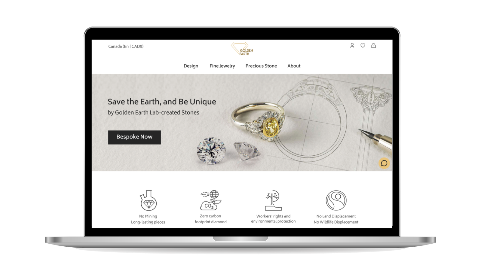
Golden Earth is a jewelry website for desktop devices. The main focus of this online shop is make jewelry from materials sourced in an ethical manner and hand-crafted for those who care about the environment and want something unique.
I created this project as a part of 2-month program at UX-Land Online School focused on User Interface with creative ideas.
I started by defining a hypothetical stakeholder and determined its requirements and limitations in the first stage.
As “Golden Earth” is a sustainable jewelry store in Montreal where each jewel is made from start to finish, it needed a website that would be able to introduce the business and provide customers with a bespoke method of purchasing the product.
Since the products are the result of high technology, laboratory made precious stones and sustainable Fairtrade gold, developing auser-friendly site, will give it a good chance to have loyale fans.
Problem Statement
Creating a website for online purchases.
Promoting sustainable jewelry in the most effective way.
Educating people who are unaware of sustainable jewelry.
Goals
Design a user-friendly interface for customers searching for sustainable fine jewelry based on three key values: high quality, unique design and compatible with user style.
A minimal website with a simple purchase process.
Easy to follow process for creating bespoke products.
Using an easy-to-use interface to present the benefits of lab stones and Fairtrade Gold in order to spread the sustainability message.
THE PROCESS
My 2-month design sprint consisted of 4 phases:
Note: there is no doubt that iteration is necessary during all phases.
My first step to solving the problems was researching sustainable Jewelry and understanding our target users’ needs.
Thus, the study started with 4 phases:
Online Survey,
Competitive Analysis,
Interviewwith Prospective Users,
Minimum Viable Product (MVP).
Online Survey
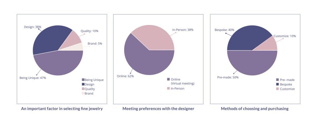
In my survey, I received 36 responses from people who were interested in purchasing fine jewelry in the future. While some had no experience purchasing fine jewelry, others had made purchases in the past, either for themselves or as gifts.
47%
Uniquely designed fine jewelry
40%
Bespoke methods
62%
Virtual meetings
The Survey Summary
Uniquely designed fine jewelry was preferred by 47 % of respondents.
Although 50% of respondents purchased pre-made jewelry, 40% preferred bespoke methods, which is our business goal.!!
62% of respondents preferred virtual meetings (online)
It is more probable that designing unique fine jewelry with the assistance of an experienced designer in a virtual meeting will be a successful business.
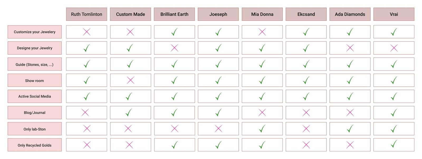
Competitive Analyses
I conducted a competitive analysis to better understand jewelry, sustainability, and determine how the market will react to new concepts of sustainability in the Jewelry industry. More specifically, small jewelry green companies and mid-size sustainable companies.
I focused on all the ways each design tried to build comfort in the user’s decision-making process. I analyzed two kind of categories in websites:
Available features in competitors’ websites
Usability evaluation of competitors’ websites
Feature Comparison
Usability Evaluation
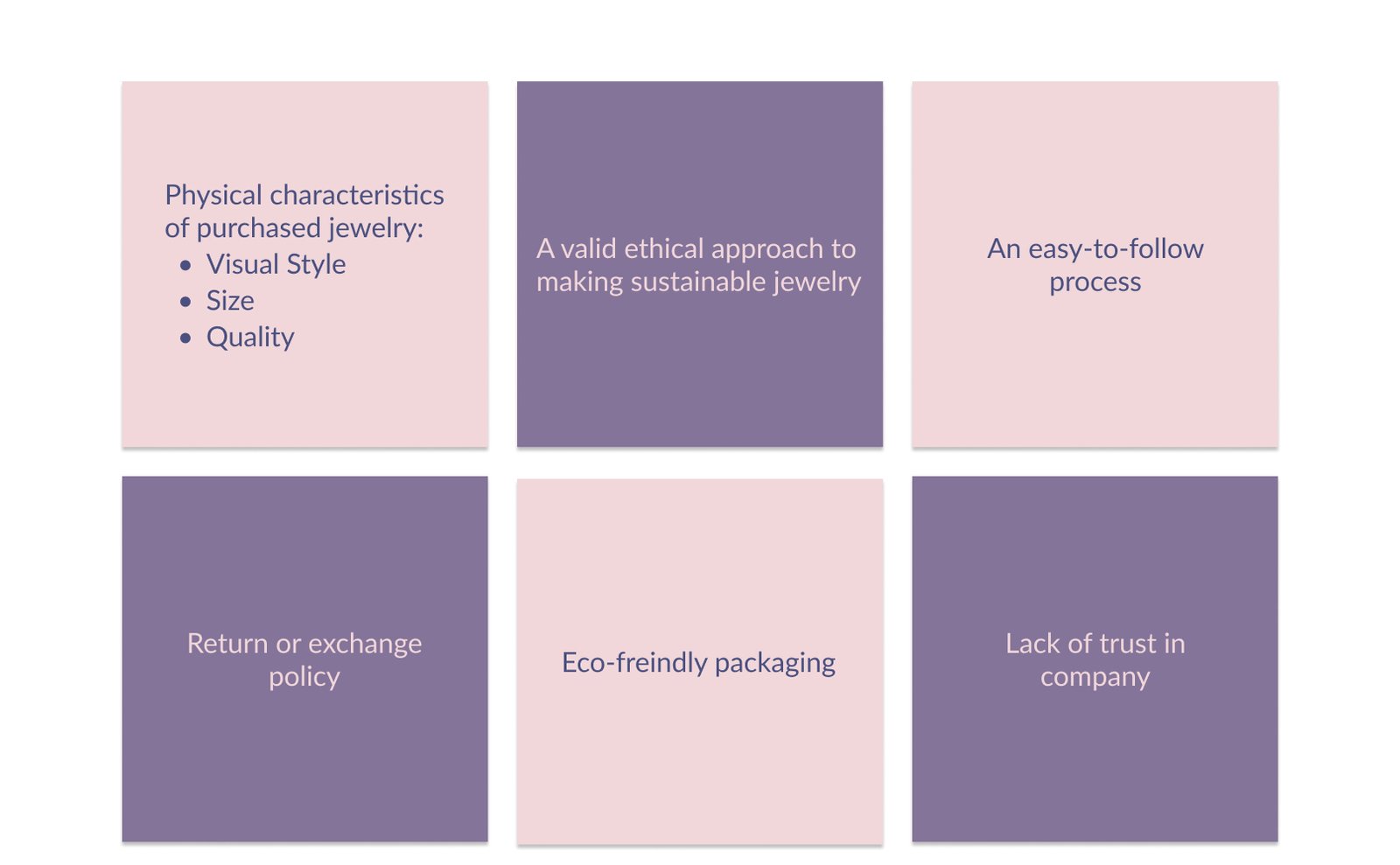
Interviews
Using the findings from the survey, I interviewed 4 participants to determine:
How an online experience could replicate the in-person experience.
What made them comfortable and uncomfortable about purchasing fine jewelry online.
How designers can assist them in choosing their products more effectively.
The main concerns of target users have been listed below based on the results of my interviews.
The Interview Summary
MVP Features
To identify the features I should design first, I created a MVP (Minimum Viable Product) matrix.
MVP Feature Prioritization Matrix
Define
Challenges & Solutions
Using the synthesized research findings and MVP, I confirmed my original hypothesis, determined challenges and tried to find a solution in my design.
Persona
As the result of the research, I created a persona to communicate information about the users. Emily’s needs and preferences will guide the design.
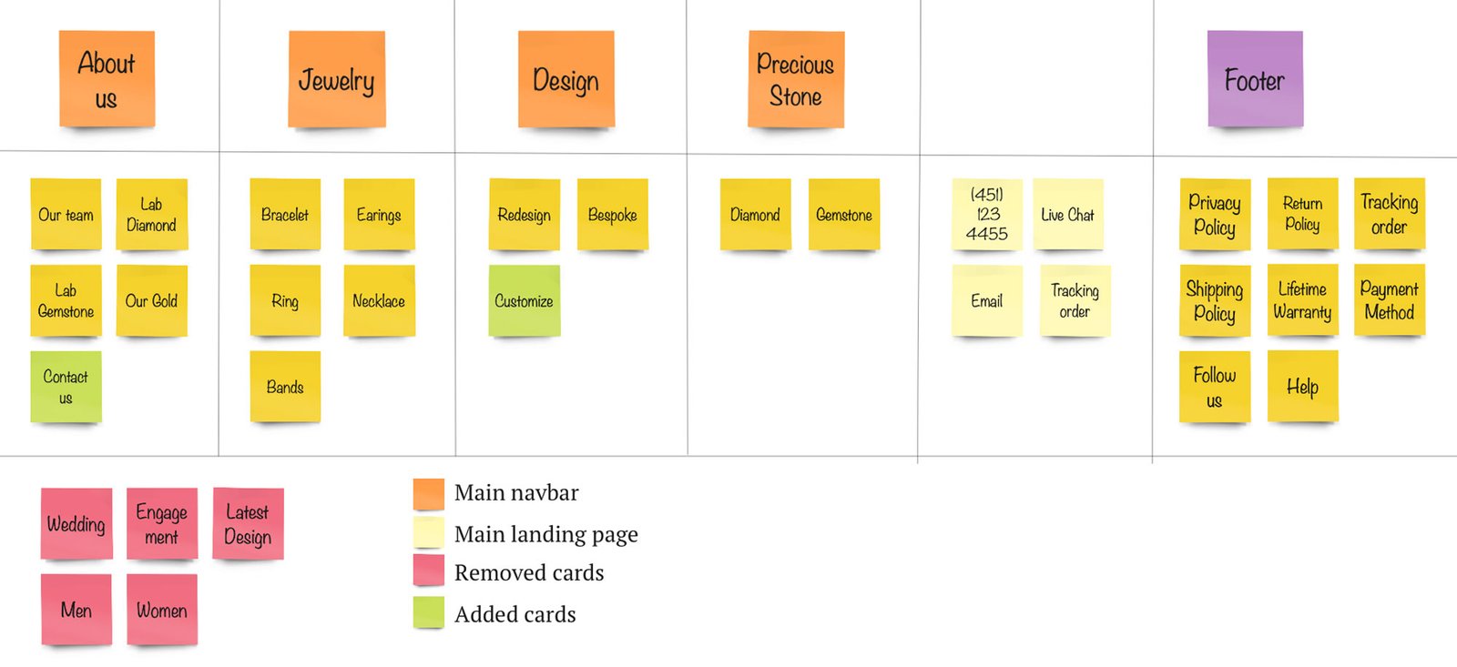
Card Sorting
I conducted an open card sorting based on a competitive analysis of eight existing websites. Then, I attended a Zoom meeting with 7 people, all of whom participated in the online survey and were able to offer assistance for categorizing the carts. The following is the result of the card sorting process.
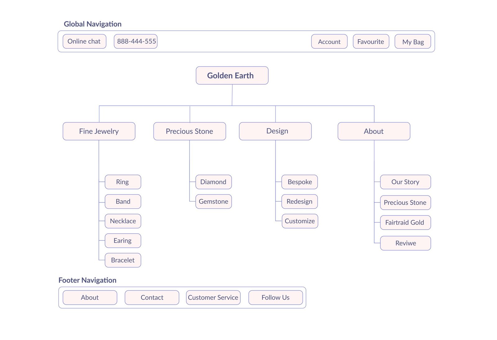
Site Map
I create a site map after cart sorting to redesign the information.
Design
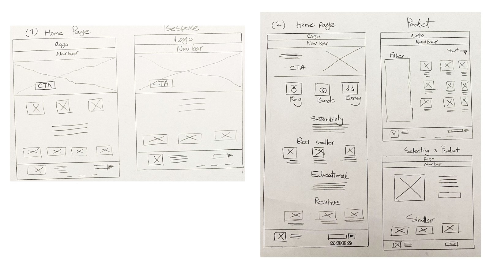
Sketches
In order to explore how each step of information architecture and research would look and feel practically, I created low-fidelity wireframes by hand sketching.
Since sustainability was the most important feature of the products, I placed extra emphasis on it. Also, I focused on the bespoke flow to ensure the process can be carried out easily.
Sketches
Mid-Fidelity Wireframes
I created low-fidelity wireframes in Figma before planning page layouts. I created the final content after several rounds of iteration.
Mid-Fidelity Wireframes
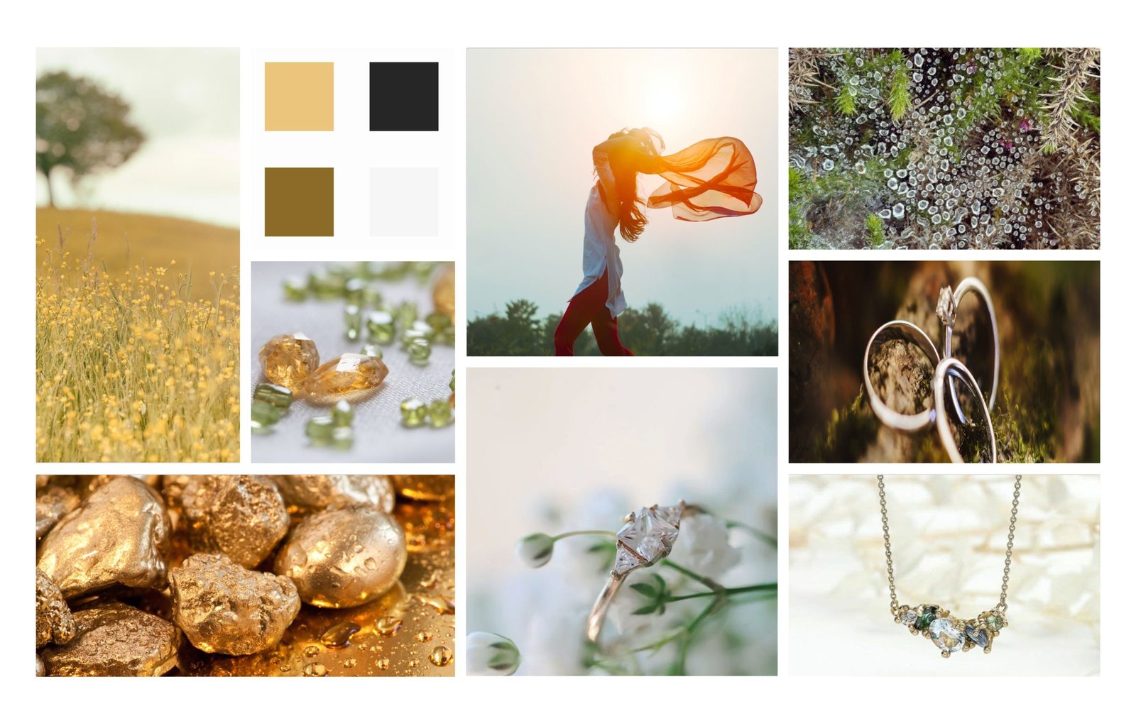
Moodboard
The color palette, I created was inspired by our moodboard. Golden Earth’s name sounded well with a color palette featuring warm earth tones and gold. It also reflected the company’s sustainability values.
Moodboard
UI Kit
In order to design high-fidelity interfaces, I established a design system that defined colors, fonts, and dimensions of elements that should be consistent on all screens.
UI Kit
High Fidelity Wireframes
A few High Fidelity wireframes are shown below. It is important to note that the images used for this project came from Google or sustainable stores since it was a class project.
High Fidelity Wireframes
Usability Tests and Iterations
During the design process, I received several helpful feedback from mentors on UI kits and wireframes. This led to several iterations of my design. What follows are pictures and descriptions of the differences between the first and final wireframes.
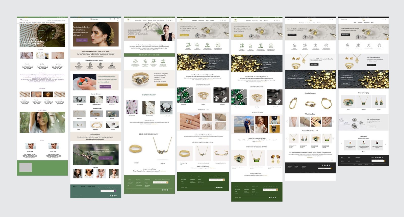
All Iterations on “Home Page”
All Iterations on “Home Page”
All Iterations on “Home Page”
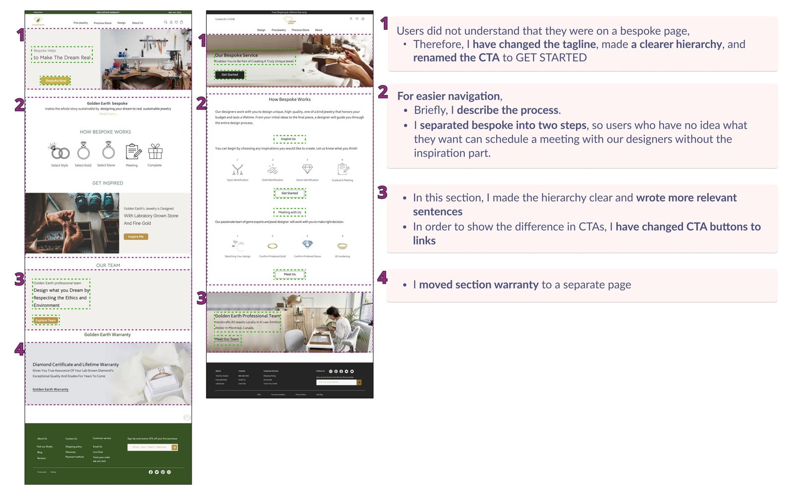
Bespoke Page Iterations
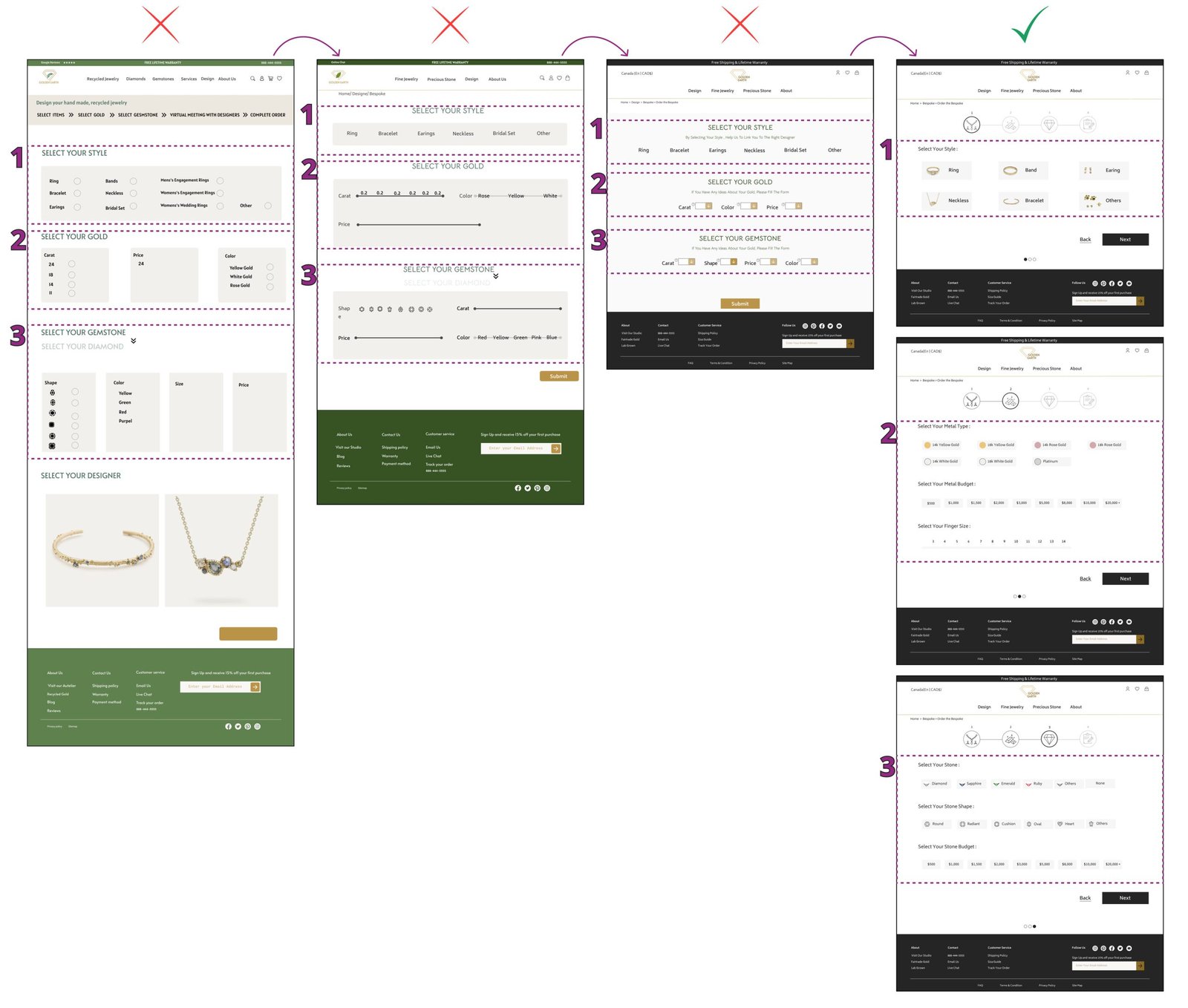
Bespoke Process iterations
Logoiterations
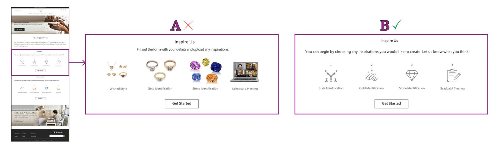
A/B Testing
Following several usability tests, I created two versions of the Hi-fi prototype and performed A/B testing on them. After receiving feedback and recommendations, I incorporated them into the final prototype.
A/B testing of Header Icons
A/B Testing of Hovering in Navigation Bar
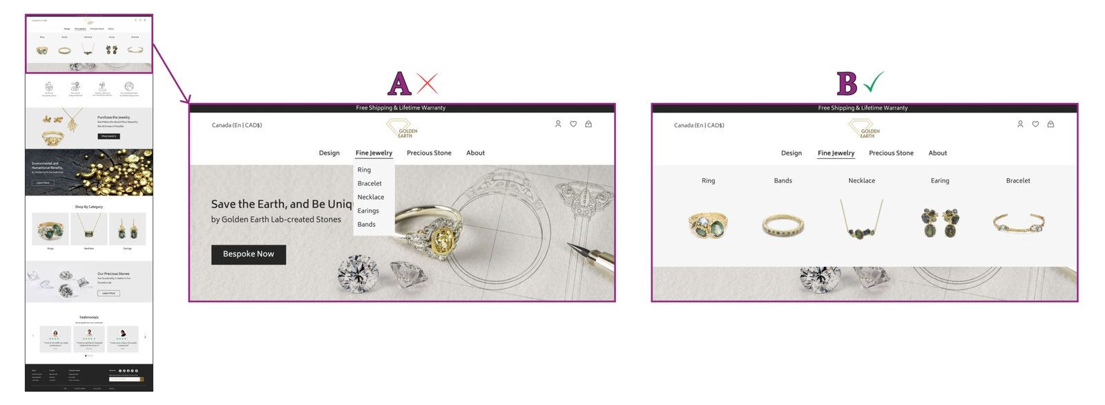
A/B Testing of Hovering in Category
A/B testing of How Bespoke Works
Deliver
Final Prototype
In this section, you can check out our complete final prototype.